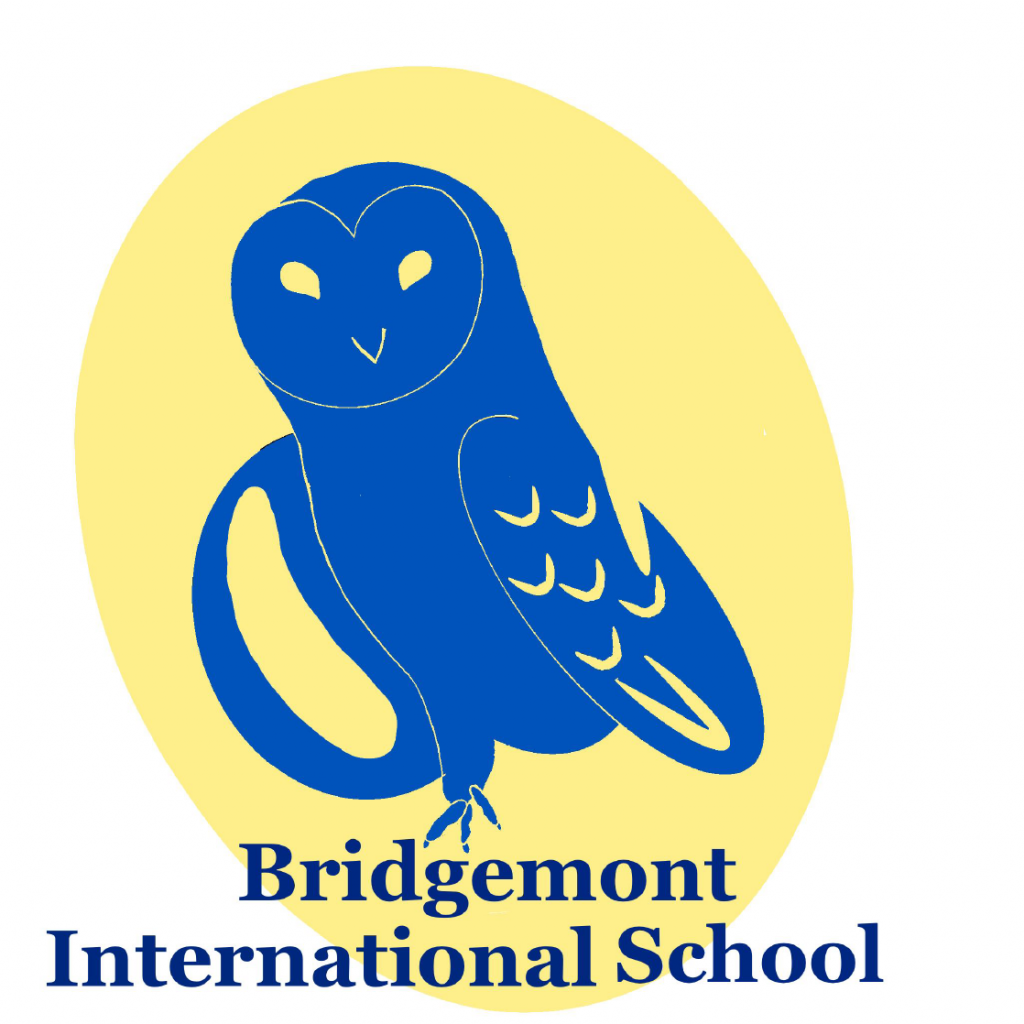
We have a guest writer this week – Oak! Oak is a student at Bridgemont who recently completed his Work Shadow week by playing the role of a Marketing Specialist. He helped with social media planning, a little content writing (including this blog post!) and some graphic design work. His favorite “assignment” of the week was redesigning the Bridgemont logo. Below he explains his process of how he came up with the design, colors, and mascot.
I started by thinking about what Bridgemont means to me. After thinking for a little I came up with: Bridgemont is a small, growing, creative, and fun community. I thought about colors that could represent these things. I decided on the colors red, yellow, and green. I ultimately ended up choosing the original Bridgemont blue and a pale yellow. I thought this ended with a nice color balance.
After the colors I wanted to choose an animal for the logo. I previously wanted the school’s mascot to be an owl and barn owl started with the letter B. So I decided to use a barn owl. I then looked up the meaning of owl and it said “wisdom, intuition, supernatural power, independent thinking, and observant listening” these are all things that I see in Bridgemont students and Guides except maybe supernatural power.
For the drawing (yes, I drew it) I used an app on my iPad called Procreate. I started by using black and sketched the shapes until I was happy with it. Then I made the face and went from there to make the neck then wings, and last but not least the foot and stomach. Then I added feathers and turned it into a simple design, then colors and I was finished.
During this whole process Miss Jess led me through and gave me feedback so I did not do this by myself.
-Oak

